Specifications
The monitor features an IPS panel with 1920 x 1200 resolution that outputs colours using 6-bit+ FRC (Frame Rate Control) dithering. This is very common on (non-VA) monitors of this price and given the excellent dithering algorithms used by LG is of little or no consequence for most users. Other points to note include a 5ms grey to grey response time, indicating that grey to grey acceleration is used and a typical retail price of £250 in the UK. This is comparable to the launch price of the U2412M which is now marginally cheaper given its age. This monitor is currently not available globally, with no local availability in the United States for example.
The key ‘talking points’ of the specification have been highlighted in blue.
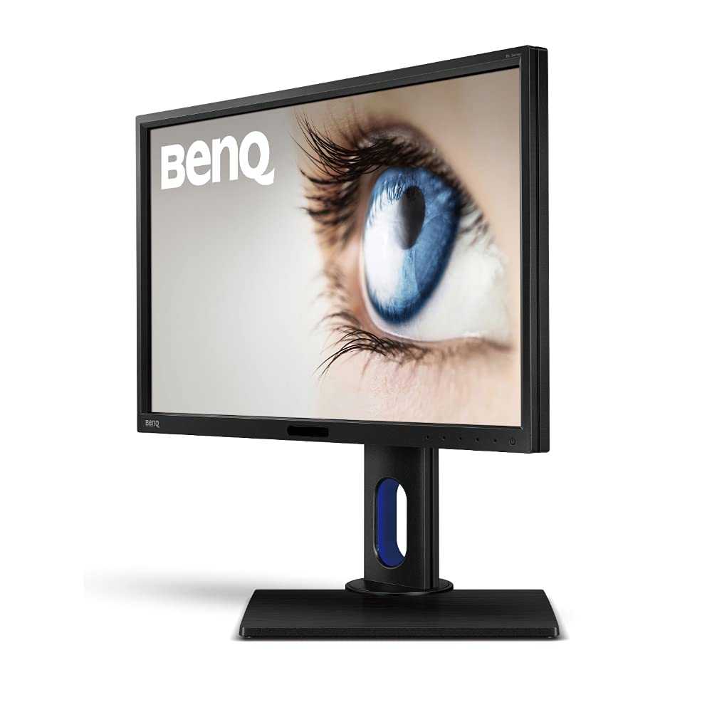
Screen size: 24 inches
Panel type: LG Display LM240WU8-SLD1 IPS (In-Plane Switching) LCD
Native resolution: 1920 x 1200
Typical maximum brightness: 300 cd/m2
Colour support: 16.7 million (6-bits per subpixel plus dithering)
Response time (G2G): 5ms
Refresh rate: 60Hz
Weight: 6.7kg
Contrast ratio: 1,000:1 (20m:1 Dynamic Contrast)
Viewing angle: 178º horizontal, 178º vertical
Power consumption: 39.2W typical
Backlight: WLED (White Light Emitting Diode)
Typical RRP as reviewed: £250
Colour reproduction
Colour gamut
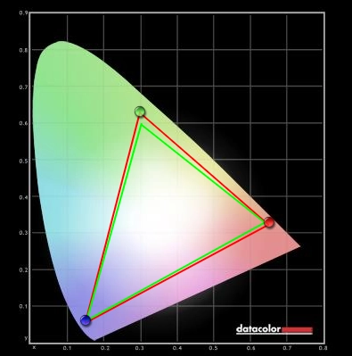
The BenQ BL2411PT offers comprehensive coverage of the sRGB colour space, as shown below. There was slight over coverage, particularly in the green region on this diagram, but nothing alarming. If this is going to be an issue for users (i.e. colour critical work) it is something that calibration will fix very readily. The monitor does provide a good base for proper calibration using appropriate hardware.


Colour in games and movies
In Battlefield 3 the colour performance was very pleasing with everything looking much as it should. Earthy browns and khaki colours showed the correct tone and appropriate variety. The greens of vegetation included some particularly good minty and fairly rich deep shades without an inappropriate and unappealing yellow hue. Whilst vibrant elements didn’t have the ‘in your face pop’ of a decent glossy screen they still looked quite vivid and lively. The warm orange glow of raging fires and deep yellows of markers on the HUDs of aircraft were particularly impressive.
On Dirt 3 there was an excellent variety of rich and natural colours. Greens were particularly impressive with some good deep and lush shades shown alongside a good range of lighter shades. The rally tracks in Finland showcased this variety particularly nicely. Dusty khaki colours found on the Kenyan rally tracks also had a good natural look to them without any inappropriate tints or inconsistency at different points of the screen. The car paint jobs were dashing and vibrant with some impressive deep reds, yellows and blues. There were also various bright ‘neon’ shades that stood out well.
On our first Blu-ray test title, Skyfall, performance was strong with rich and appropriately saturated colours. An excellent variety of subtly different shades (such as skin tones) was displayed. Some impressively vivid deep red and blue shades were also evident in some scenes, such as the Shanghai night scenes where neon lighting features.
The second Blu-ray tested was Futurama: Into the Wild Green Yonder. Colour performance was again strong with vivid colours such as neon greens, bright pinks and yellows standing out very nicely. Strong and deep colours (particularly red) were also displayed well. In amongst these more striking shades there was a pleasing range of ‘quieter’ shades. Even closely matched skin tones and other colours throughout the scene revealed even the slightest of distinctions. The ability of a shade to remain very consistent regardless of on-screen position and therefore have its own correct ‘identity’ is a luxury afforded to users by IPS technology.
Introduction
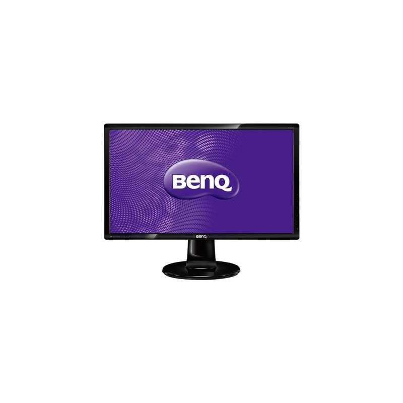
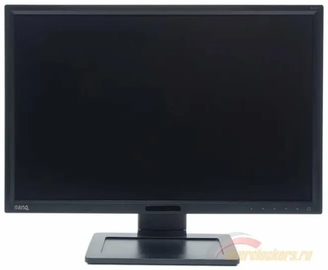
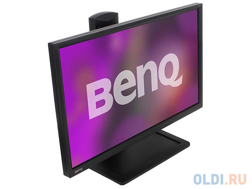
Although some new 24” 16:10 monitors do crop up now and then they are a relatively rare breed compared to their dominant 16:9 cousins. The BenQ BL2411PT is an interesting monitor not only because of it ticking the 16:10 box, but because it’s BenQ’s first IPS (In-Plane Switching) monitor. This is an interesting change of direction for a company that focuses much of their efforts these days on VA (Vertical Alignment) and TN (Twisted Nematic) panel technologies. Alongside promise of improved viewing angles and colour performance from the IPS matrix a big selling point for this monitor is its ‘flicker free’ backlight. We put this screen through its paces in our gauntlet of movies, games and other tests.
Contrast and brightness
Contrast ratios
Using a KM CS-200 we measured the white luminance, black luminance and calculated the resultant contrast ratio using a range of monitor settings. The results are shown in the table below, with black highlights indicating the highest white luminance, lowest black luminance and highest contrast ratio yielded. Blue highlights indicate the results using our test settings as described in the calibration section.
| Monitor Profile | White luminance (cd/m2) | Black luminance (cd/m2) | Contrast ratio (x:1) |
| ‘Standard’ 100% brightness | 303 | 0.25 | 1212 |
| ‘Standard’ 80% brightness | 262 | 0.22 | 1191 |
| ‘Standard’ 60% brightness | 223 | 0.18 | 1239 |
| ‘Standard’ 40% brightness | 181 | 0.15 | 1207 |
| ‘Standard’ 20% brightness | 140 | 0.12 | 1167 |
| ‘Standard’ 0% brightness | 96 | 0.08 | 1200 |
| Test settings | 179 | 0.15 | 1193 |
| ‘Standard’ Gamma 1 | 303 | 0.25 | 1212 |
| ‘Standard’ Gamma 2 | 303 | 0.25 | 1212 |
| ‘Standard’ Gamma 4 | 303 | 0.25 | 1212 |
| ‘Standard’ Gamma 5 | 302 | 0.25 | 1208 |
| ‘sRGB’ | 281 | 0.24 | 1171 |
| ‘Reading’ | 126 | 0.12 | 1050 |
The BenQ BL2411PT produced an average static contrast (where brightness only was adjusted) of 1203:1 which is as high as we’ve seen from a non-VA LCD panel. This strong performance was maintained when ‘Gamma’ mode was changed and in the ‘sRGB’ preset. Our test settings involved some minor adjustments to colour channels but this had little effect on the contrast ratio which remained at 1193:1. The ‘Reading’ preset involved a quite significant forced shift in colour temperature giving a drop in contrast to a still very respectable 1050:1. The highest brightness we recorded was 303 cd/m2 (very close to the specified 300 cd/m2) and the lowest brightness was 96 cd/m2. It’s good to see a 2 figure minimum, although some users may like a brightness that is even lower. This can be achieved by lowering the colour channels at the expense of contrast and image performance. At any rate the luminance adjustment range of 199 cd/m2 is decent but not exceptional.
The monitor also features a Dynamic Contrast mode that can be activated in ‘Movie and ‘Photo’ modes. In this mode the backlight (brightness) rapidly adjusts to how light or dark the image is. The strength of the effect can be adjusted between ‘1’ and ‘5’, with lower values giving a more limited luminance adjustment range. Even at the lowest setting the scene tends to be too bright for most mixed images but dark content is handled better. This mode essentially does what it says on the tin but is limited in its appeal due to the poor presets that accompany it and the fact that scenes are often a complex mixture of light and dark content. Because the backlight is all controlled as one unit the image of the whole screen must be adjusted to suit the overall makeup of a given scene.
PWM (Pulse Width Modulation)
The BL2411PT is part of BenQ’s ‘Eye-Care’ initiative and is specifically marketed as ‘flicker free’. We can confirm that this is the case and that the monitor does not use PWM (Pulse Width Modulation) at any brightness to regulate the backlight. Some users are sensitive to this flickering and suffer unfavourable side-effects by using such monitors, so it’s nice for them to know that this monitor is ‘flicker free’ as promised.
Luminance uniformity
When looking at a black screen in a darkened room, using our test settings, there was a very small amount of backlight bleed in the bottom right corner. This was not at all bothersome during actual use and was drowned out by ‘IPS glow’ during normal use anyway. ‘IPS glow’ is a concept explored in more detail and shown in a video later in the review. It manifested itself as a silvery sheen that ‘blooms’ if you move to view the monitor from an angle but is also visible when viewing the monitor from a normal position.
Viewing angles
To delve deeper into the strengths of this monitor’s colour consistency we used Lagom’s tests for viewing angle. The following observations were made.
- The purple block appeared a solid lilac throughout without any significant pink tints. There was a mild pink hue towards the very top left but nothing alarming.
The red block appeared a fairly rich red throughout without any noticeable pink tint or hue change.
The green block appeared a slightly yellowish green throughout without any obvious shifting to a stronger or weaker yellow tint.
The blue block was royal blue throughout.
The Lagom text revealed that the monitor’s gamma curve has a low viewing angle dependency. The text and background appeared largely blended grey shades without any obvious red, green or orange tints. This is what you would hope for from an IPS monitor.
The following video shows how little variation there is in overall contrast and colour as the viewing angle is changed (i.e. where ‘off centre’ viewing angles are considered). The camera’s white balance and focus settings were not set correctly which makes things look a bit funky at times. Hopefully you can still see that there are no overly pronounced shifts in colour and contrast and evidently greater consistency off-angle than seen on VA or TN panels. The final section of the video highlights the aforementioned ‘IPS glow’.
Conclusion
It has been a while since we last reviewed a 24” 16:10 monitor; the Dell U2412M some 2 years back. These sorts of monitor are a relative rarity on the market these days, especially models with the same sort of relatively affordable price as the U2412M. The BenQ BL2411PT is a refreshing model to see on the market, not just because it fills this 24” 16:10 niche, but because of some welcome changes that have been included. With this model BenQ and panel manufacturer LG have shown that they are quite in-touch with the desires of users for relatively slender bezels, a flicker free backlight and a light matte screen surface. Whilst anti-glare properties are certainly attractive for a monitor designed for office as well as home use there is little need to go completely overboard – it’s nice to see that toned down a bit here, preserving greater image clarity and vibrancy.
Colour reproduction is one area where IPS monitors can really excel, and here the BL2411PT did not disappoint. Following some relatively minor adjustments colour balance and gamma handling were just where we like them to be. The strengths of the IPS panel’s consistent colours, the good default setup, comprehensive sRGB coverage provided by the backlight and the light matte screen surface all combined to give a rich and rewarding experience. Contrast performance was as good as we’ve seen on an IPS panel with static contrast values comfortably exceeding the specified 1000:1. IPS glow did eat away at a bit of detail towards the edges of the screen. This isn’t something at all unique to this monitor but rather a characteristic of the panel type.
With a large part of our testing focusing on gaming it is important not just that the monitor delivers pleasing image quality but also feels and looks responsive. We were pleasantly impressed with this model in that respect. Input lag was very low and grey to grey acceleration (AMA, Advanced Motion Acceleration) well implemented to provide a level of motion blur and overall responsiveness on par with the fastest 60Hz LCD monitors out there. With this sort of performance there is absolutely no need to opt for a 60Hz TN panel to seek superior responsiveness.
Overall this was a pleasant monitor to use and review. Both externally and internally a lot of thought has gone into making for an enjoyable viewing experience – whether you’re playing games, editing photos or just surfing the internet. With its thus far unique combination of price, performance and features this is certainly one to consider.
| Positives | Negatives |
| Colours are rich, varied and well-represented following a few minor adjustments in the OSD. Colour consistency is also strong with relatively little shade variation at different points of the screen | Colours are certainly more appealing than on models with stronger matte anti-glare surfaces (such as the Dell U2412M) but don’t have quite the same pop and smoothness as a glossy surface |
| Very good static contrast performance figures and a respectable contrast performance in practice. Whites and light colours are not overly grainy | IPS glow is present which some users find irksome. Lighter colours on the screen were not as smooth and ‘pure’ as on models with even lighter matte or glossy screens |
| Very low input lag and carefully implemented grey to grey acceleration gives a performance that matches even the fastest 60Hz LCDs | Some users would prefer a greater refresh rate than 60Hz for extra fluidity – and BenQ’s ‘Premium’ AMA setting needs renaming in this case |
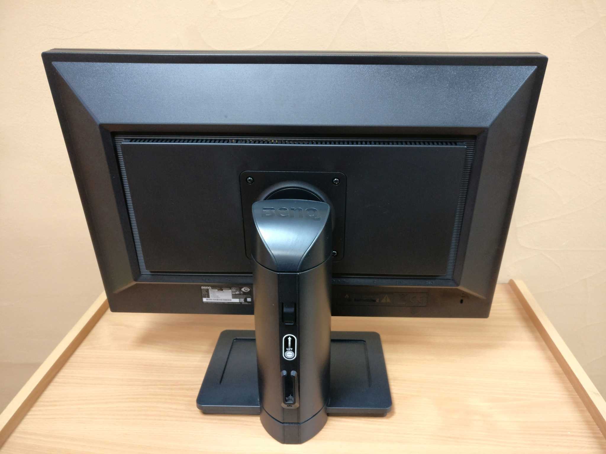
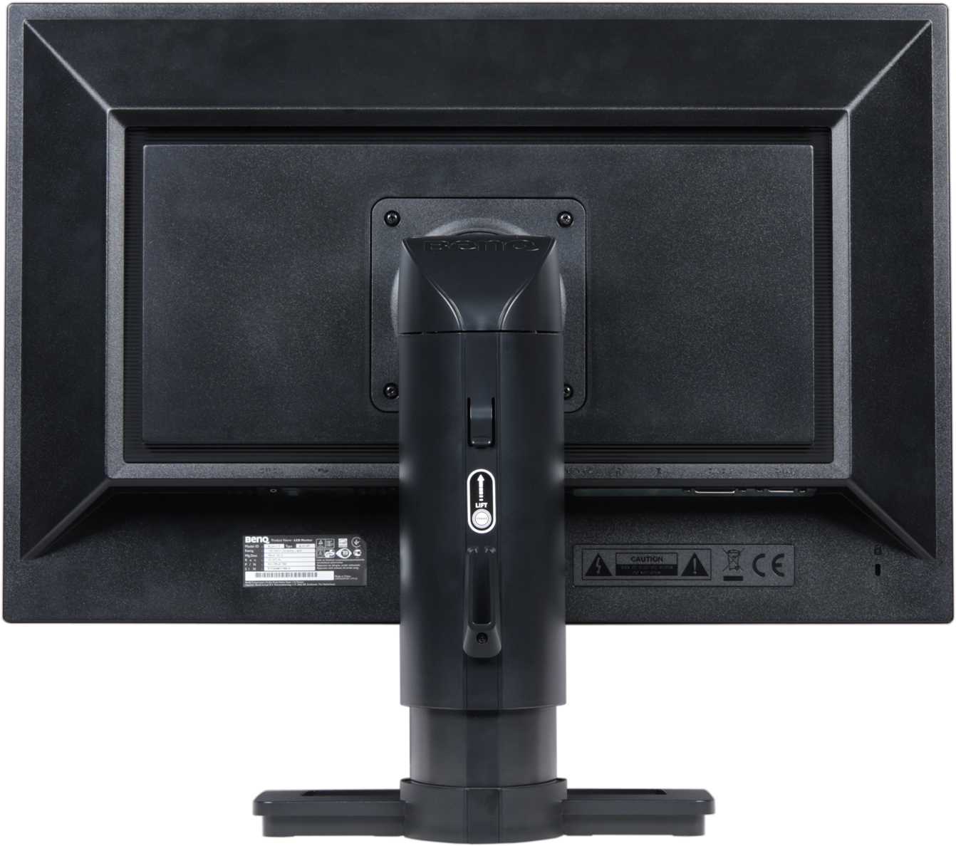
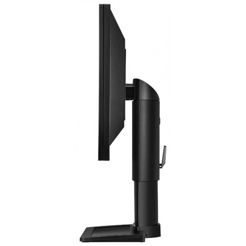
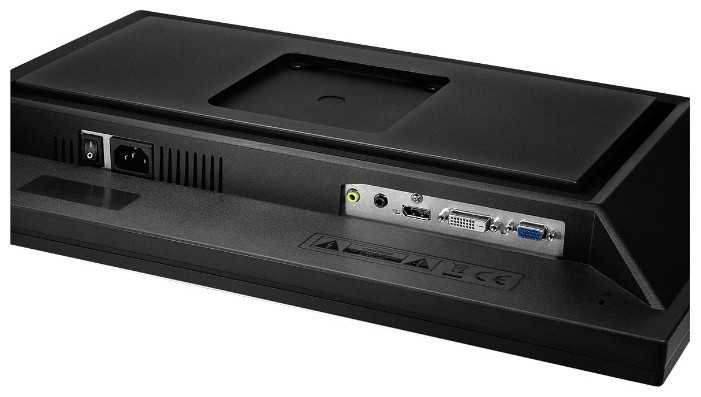
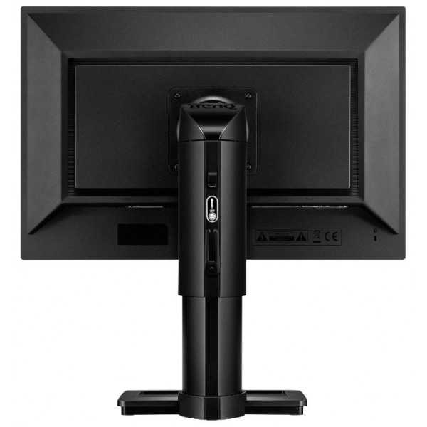
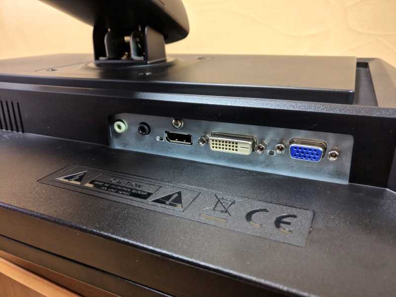
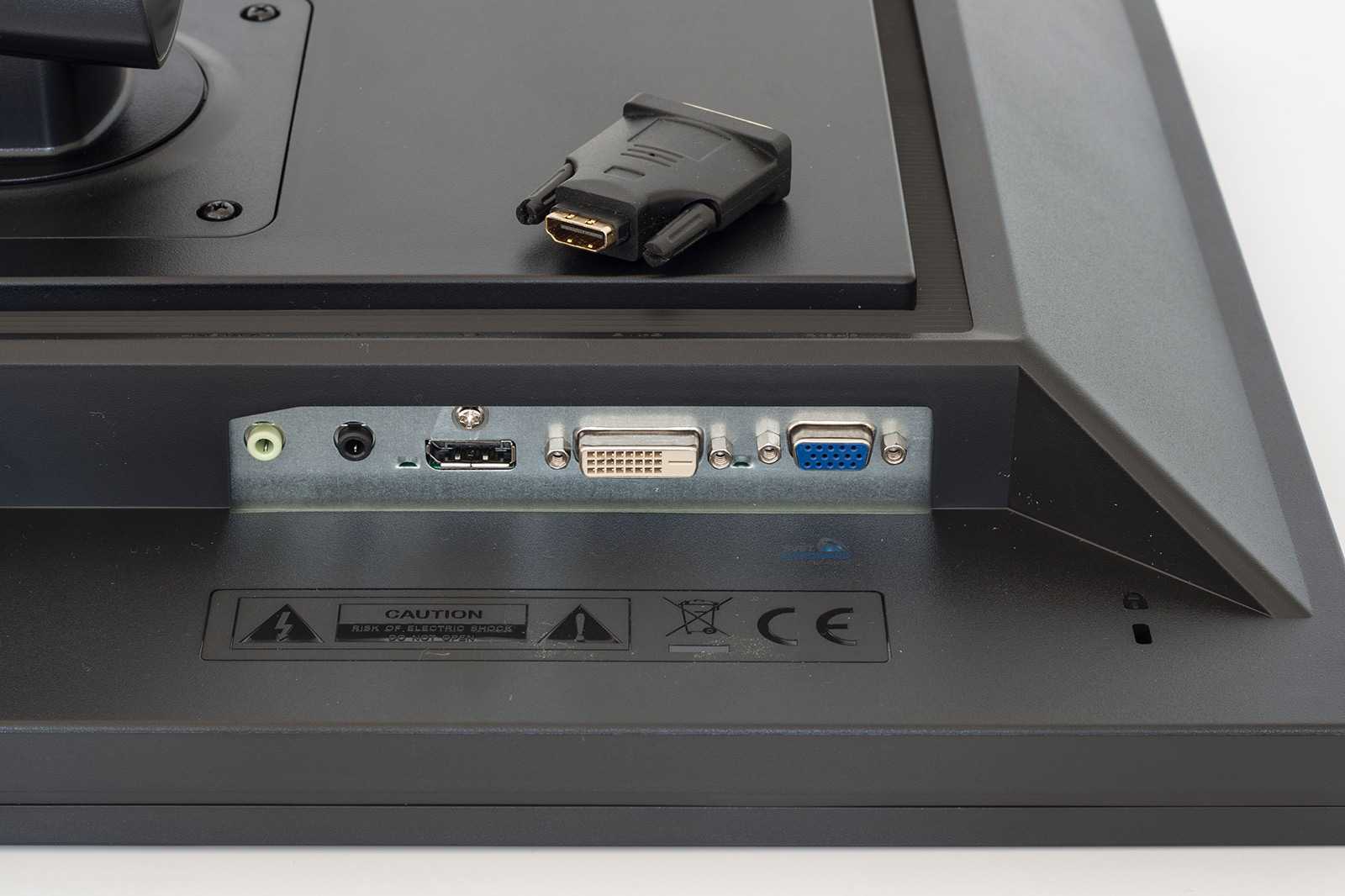
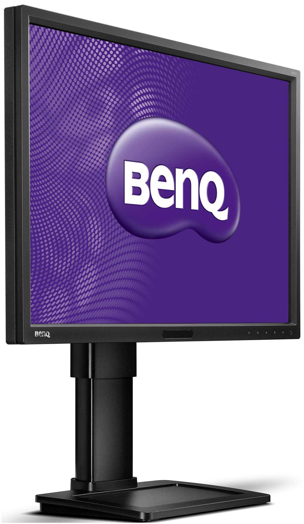
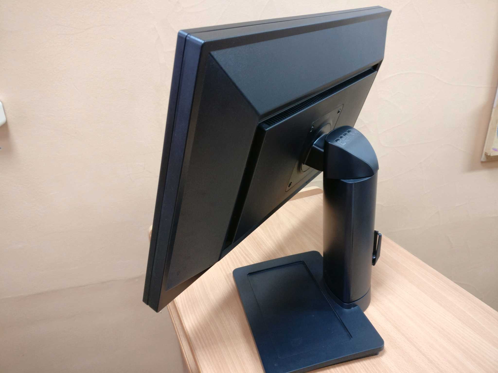
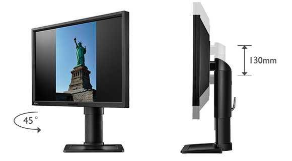
| Good ergonomic flexibility, thin bezels and a good selection of ports for PC users | No HDMI and no local availability in the US |
As an Amazon Associate I earn from qualifying purchases made using the below link.
|
|

Donations are also greatly appreciated.
Calibration
Testing the presets
Several ‘Senseye 3’ presets are available on this model; ‘Standard’, ‘Movie’, ‘Photo’, ‘sRGB’, ‘Reading’, ‘Eco’, ‘M-book’ and ‘User’. The ‘Standard’, ‘sRGB’ and ‘User’ presets give the most pleasing image with the remaining presets providing a mixture of obvious oversaturation, excessive and not adequately correctable sharpness, reduced shade range and a completely out of whack white point. As a result we focused on the 3 decent presets plus ‘Reading’ mode which we feel does serve a useful purpose for many users. The ‘M-book’ preset is designed to provide better matching between the image displayed by a Mac Book and this display so, presumably also serves a purpose, but we are testing the monitor with a desktop PC so are excluding this from our analysis. We also assessed the image using the 5 ‘Gamma’ modes in the ‘Standard’ Senseye preset. It should be noted that these are also selectable in the ‘User’ preset which is identical to ‘Standard’ with some additional settings.
Our test system used an Nvidia GTX 780 connected to the monitor using a DisplayPort cable. It should be noted that using a DVI cable or either DP or DVI on an AMD GPU gives a very similar image. We used a number of familiar images and applications as well as a Spyder4Elite colorimeter to assess the image performance of the aforementioned presets and gamma settings. The following table gives a reading for the white point and gamma recorded in the centre of the screen using various settings alongside the picture options available (preset dependent) and a subjective assessment of the image.
| Splendid Mode (Preset) | Gamma (central average) | White point (kelvins) | Extra OSD features | Notes |
| ‘Standard’, Gamma 1 | 1.8 | 6756K | Brightness, Contrast, Sharpness, Gamma, Color Temperature (Normal, Bluish, Reddish), Reset Color, AMA. ECO Sensor and Eye Protect also available. | Very bright (default brightness is 100) with shades lacking appropriate depth. A bit of a cool somewhat purple tint overall due to a relative weakness in the green channel. |
| ‘Standard’, Gamma 2 | 2.0 | 6841K | As above. | Very bright with a slight improvement in depth but still lacking in that respect. Slight purple tint remains. |
| ‘Standard’, Gamma 3 | 2.2 | 6810K | As above. | Slight purple tint and excessive brightness remains but image is much deeper with good richness and variety. Slightly oversaturated from high brightness, though. |
| ‘Standard’, Gamma 4 | 2.4 | 6797K | As above. | As ‘Gamma 3’ but more depth and oversaturation quite noticeable in places due to both brightness and gamma. |
| ‘Standard’, Gamma 5 | 2.6 | 6750K | As above. | Yet more depth, clearly too much in fact with obvious oversaturation and crushing of dark shades. High brightness and purple tint remain. |
| ‘sRGB’ | 2.2 | 6833K | Brightness, Contrast, Sharpness, Reset Color, AMA. ECO Sensor also available. | A fairly noticeable cool and somewhat purple tint. Sharpness and brightness is too high (adjustable) but overall balance to image is reasonable. |
| ‘Reading’ | 2.2 | 4755K | As ‘sRGB’. | This preset gives a dim and warm image (strong red channel, weaker green and very weak blue) that is supposed to be more restful on the eyes. The sharpness is also reduced to try to give a sort of ‘book like’ appearance. |
| Test Settings (‘User’ modified as below) | 2.2 | 6523K | Brightness, Contrast, Sharpness, Gamma, Color Temperature (Normal, Bluish, Reddish, User Define), Hue, Saturation, Reset Color, AMA. ECO Sensor also available. | Image is well balanced with a rich and varied look. The brightness and white point has been improved to correct the slight oversaturation and tint preset by default. |